COVID-19 Wayfinding
July 2020
As part of MOA’s Reopening Committee, I was asked to create a graphic system that would help visitors safely navigate the Museum during the first months of reopening. At a time when public space now came with a new set of rules, the challenge was to communicate those expectations clearly without making the Museum feel clinical or unwelcoming.
The signage needed to feel different from the social-distancing graphics appearing across the city. The messaging was serious, but the design still had to feel warm, human and recognizably MOA. It needed enough consistency to work as a system, without becoming repetitive, and to feel considered without looking overly permanent.
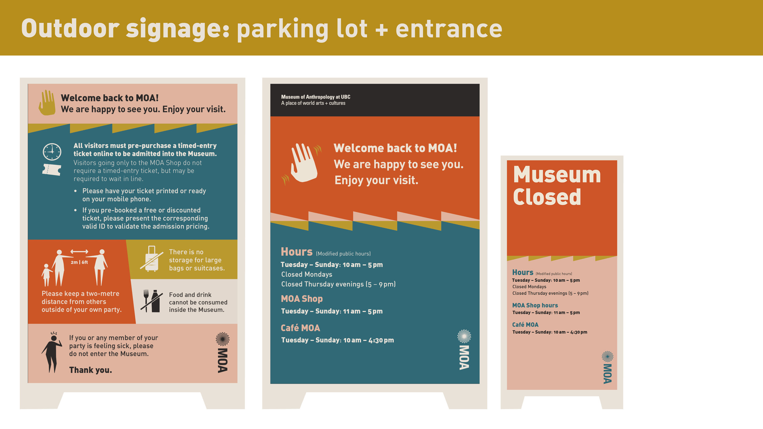
I developed a system of more than 100 signs used throughout the Museum, administration areas and grounds. A bold seven-colour palette created visibility and variation, while a family of slightly off-kilter, joyful figures brought personality to the more instructional messages. Where figures weren’t needed, simple geometric forms carried the same visual language through the rest of the system.
The project ended up drawing on many of the same principles I use in exhibition design: clarity, rhythm, consistency and an awareness of how graphics can shape the feeling of a space. In this case, the graphics helped soften the harder edges of safety protocol and made returning to the Museum feel a little more comfortable.