Playing with Fire: Ceramics of the Extraordinary
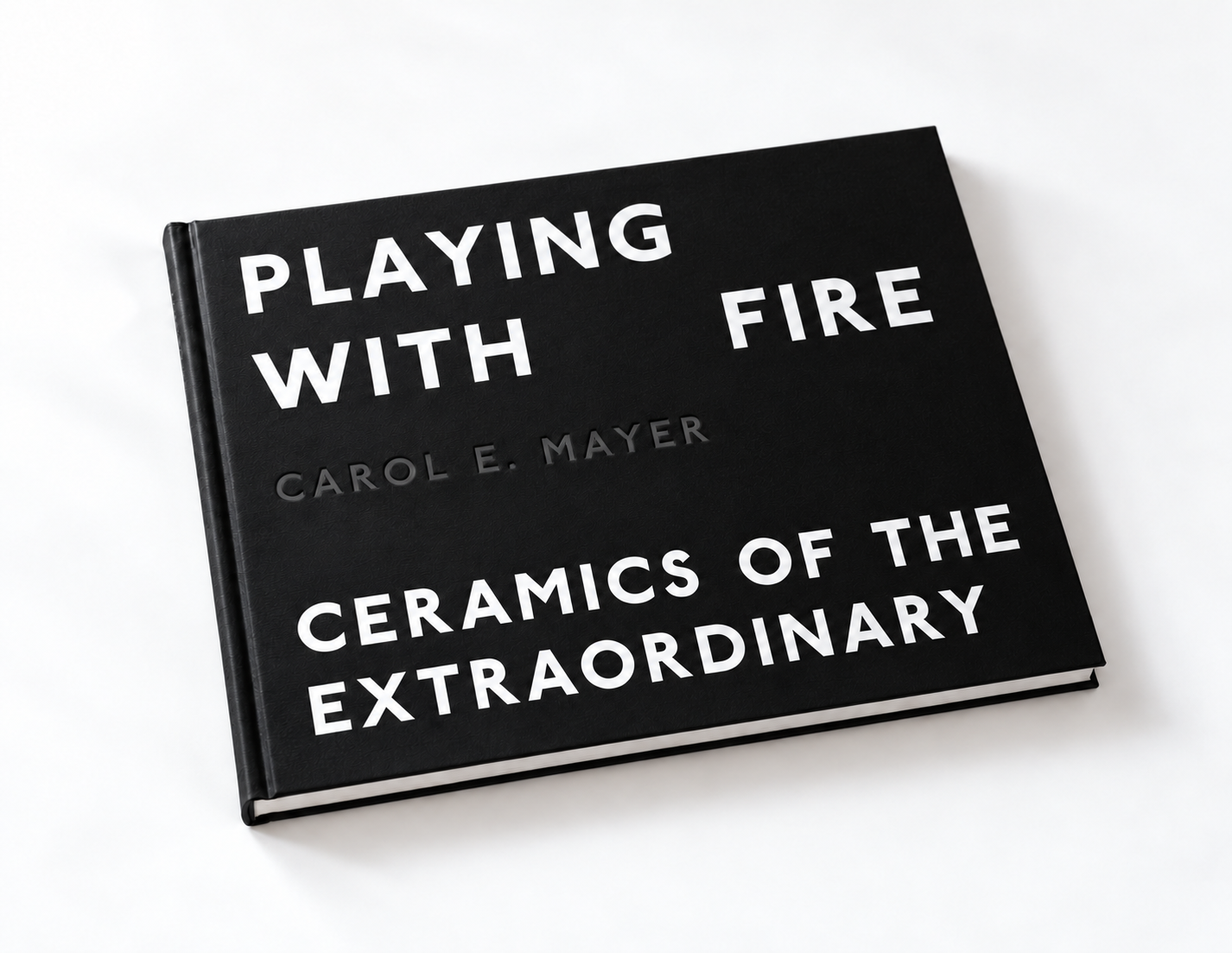
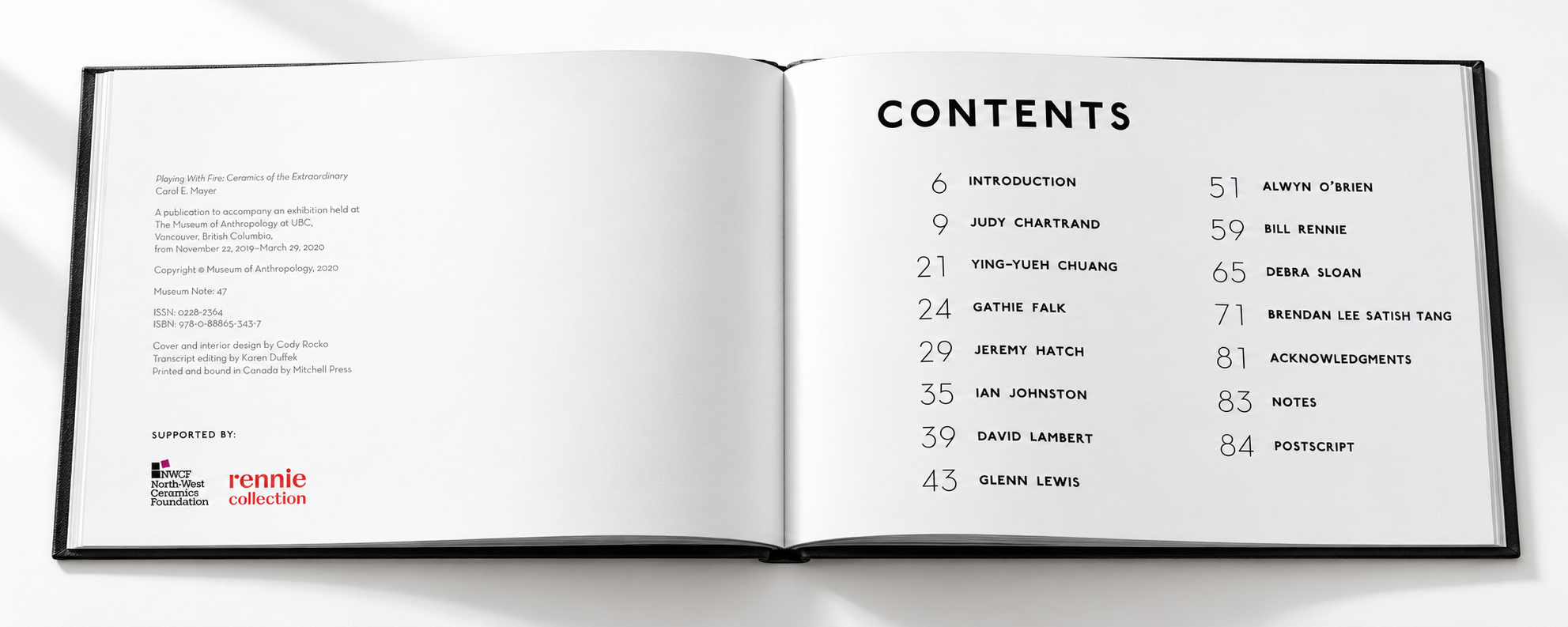
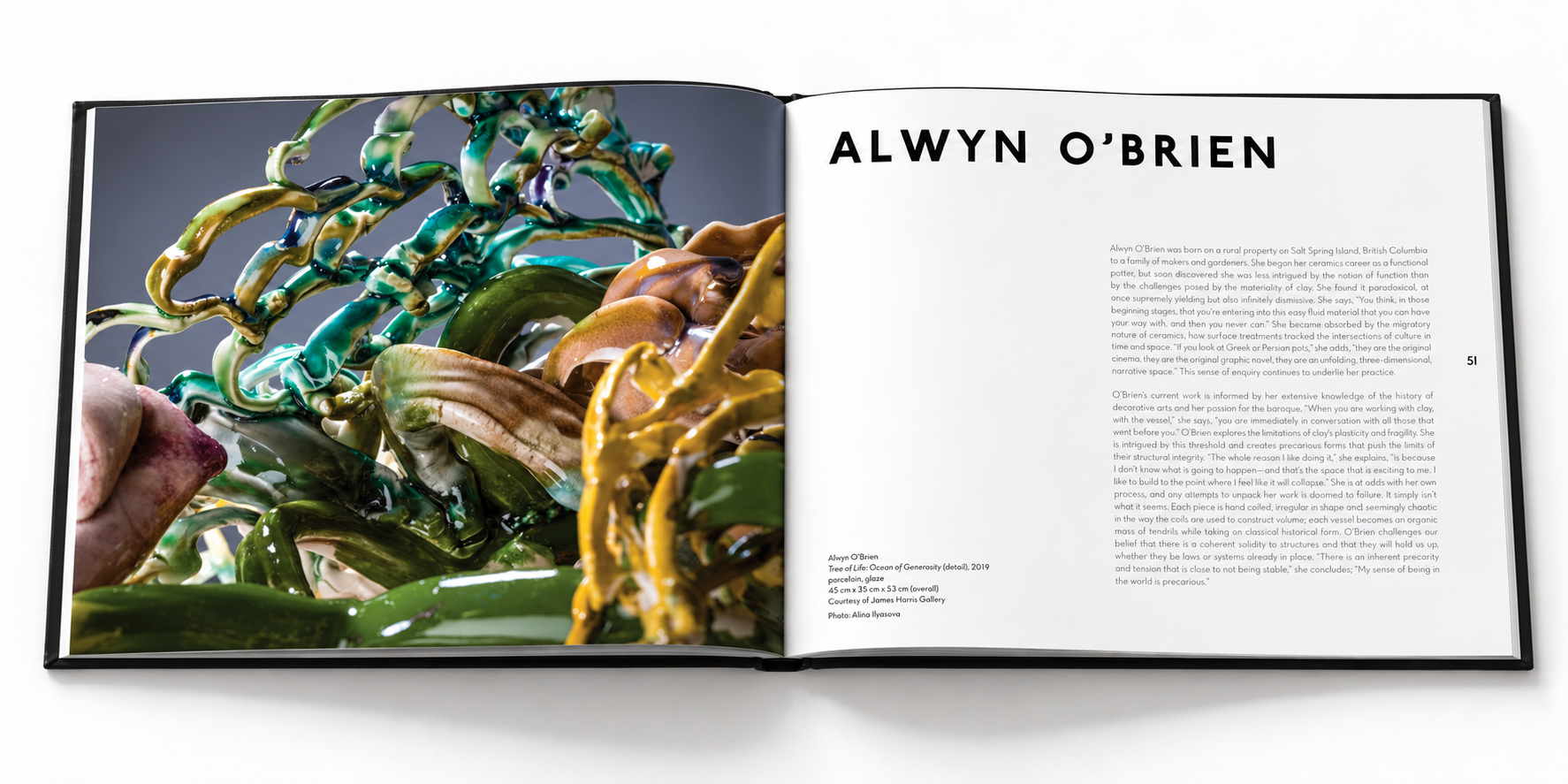
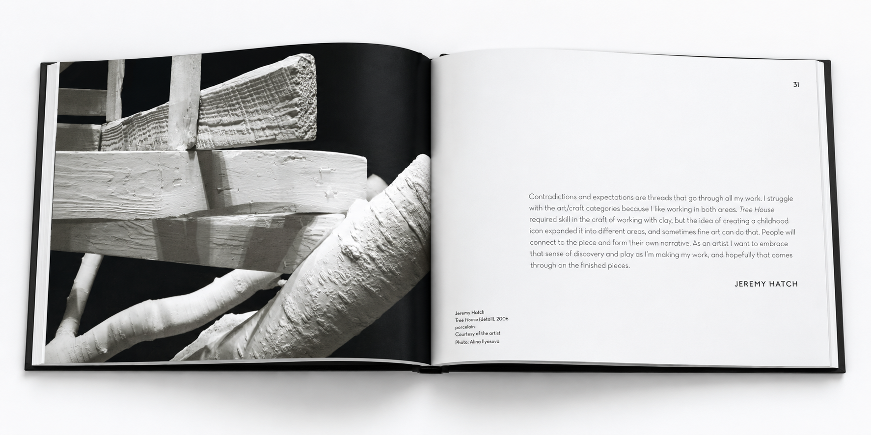
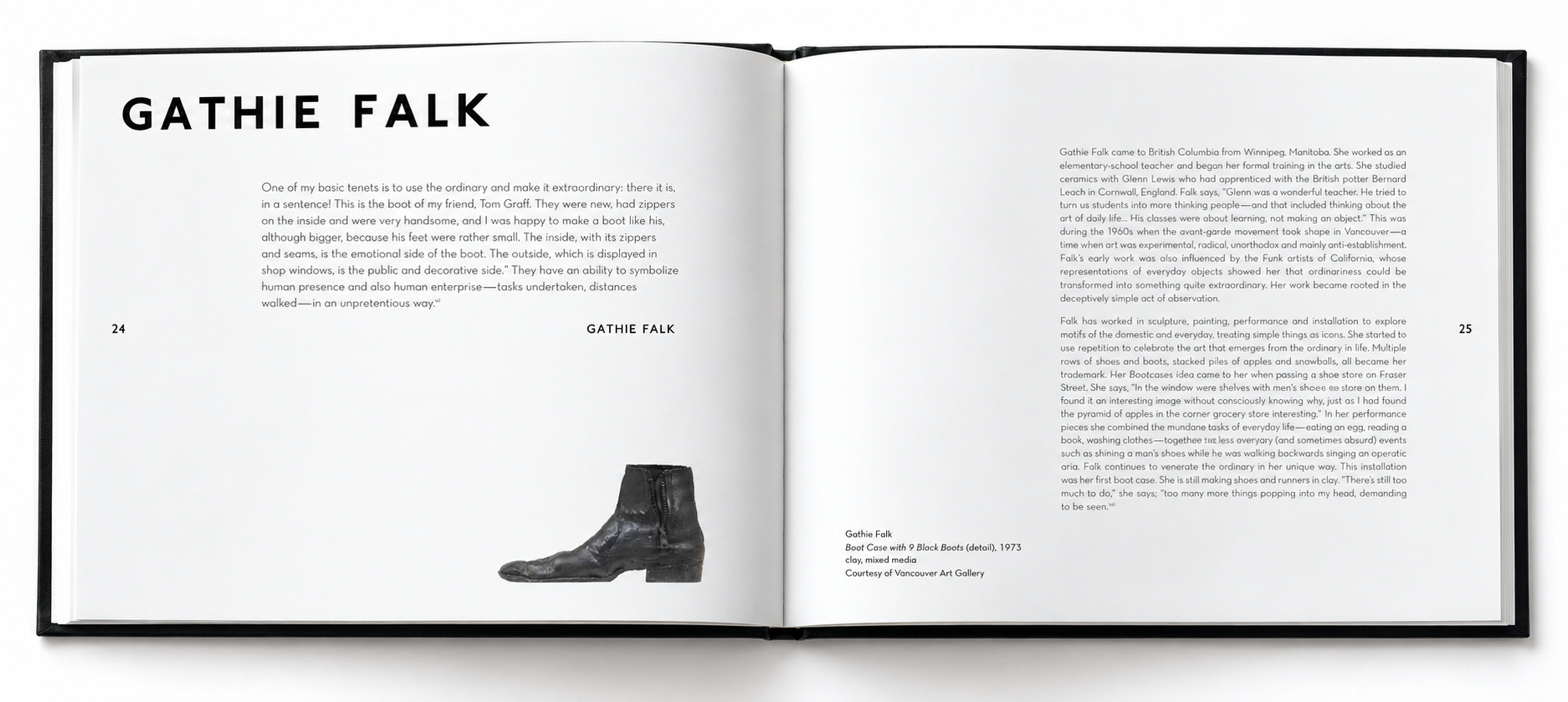
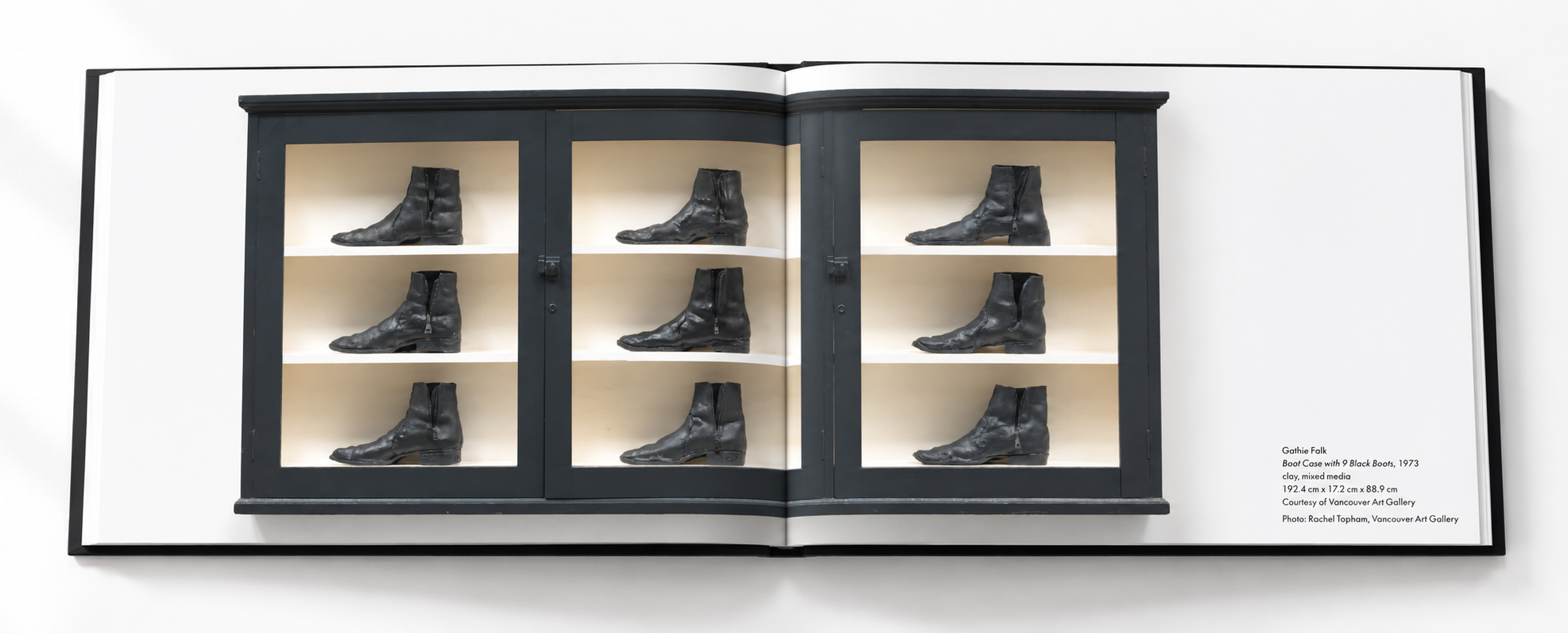
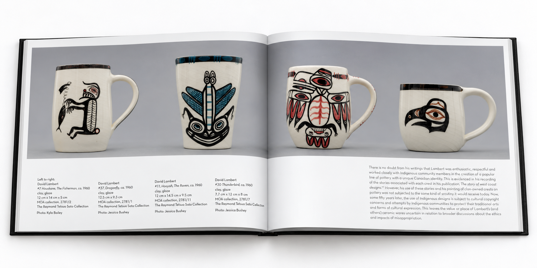
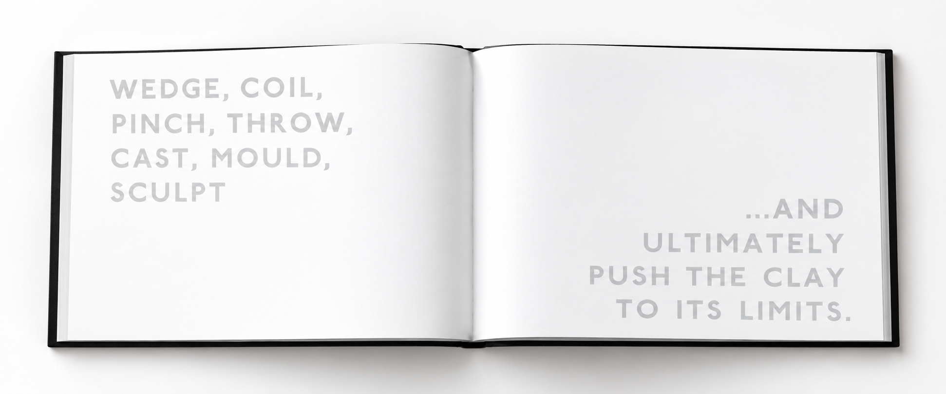
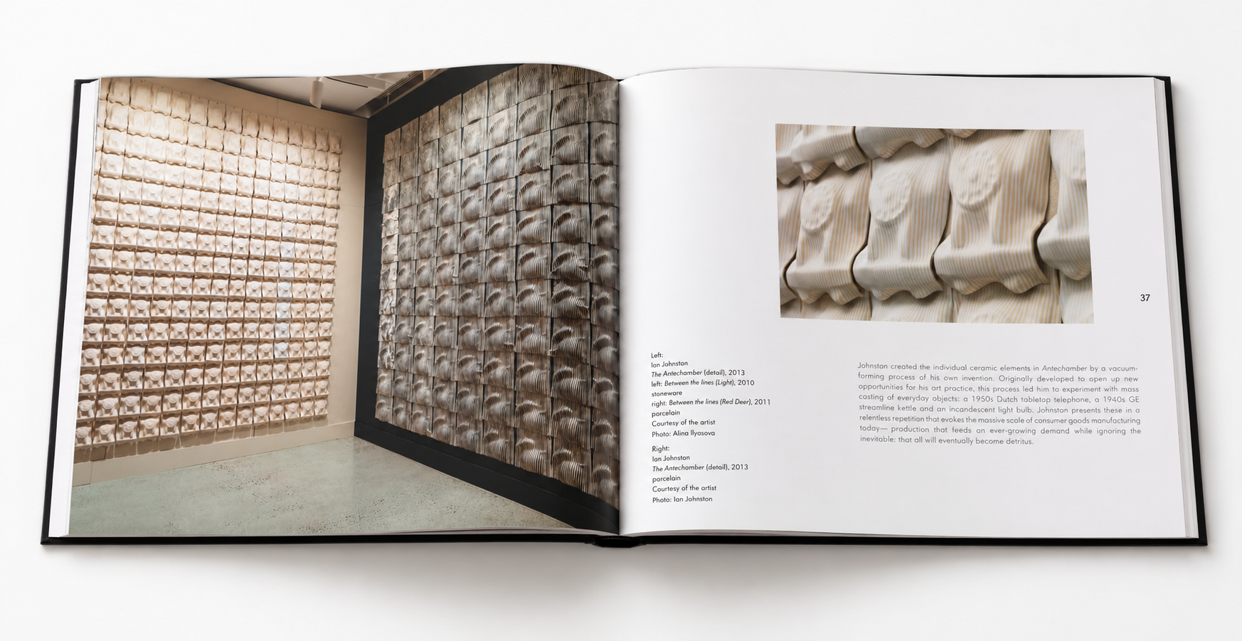
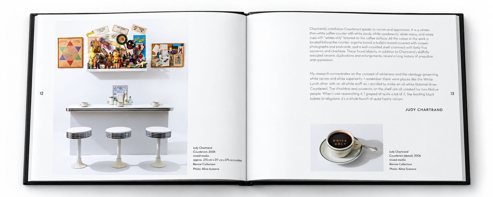
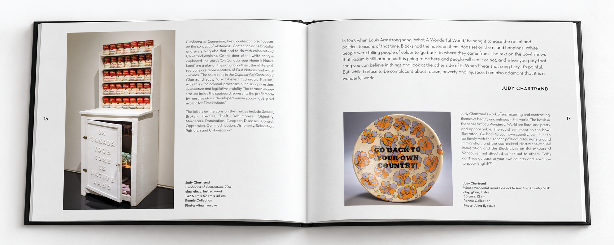
Publication Design • 2019The brief from author Carol E. Mayer was clear: this shouldn’t look like every other book about ceramics. I designed Playing with Fire: Ceramics of the Extraordinary around bold typography, strong black-and-white contrast, and a playful rhythm of images and text. Full-page photographs bring the reader close to the works’ strange, intricate details; quieter layouts give the writing room to breathe. The restrained palette lets the ceramics supply the colour. A black hardcover with embossed grey lettering sets the tone: confident, tactile, and a little unexpected.