Pacific Northwest Galleries
Museum of Anthropology at UBC · Permanent galleries · 2023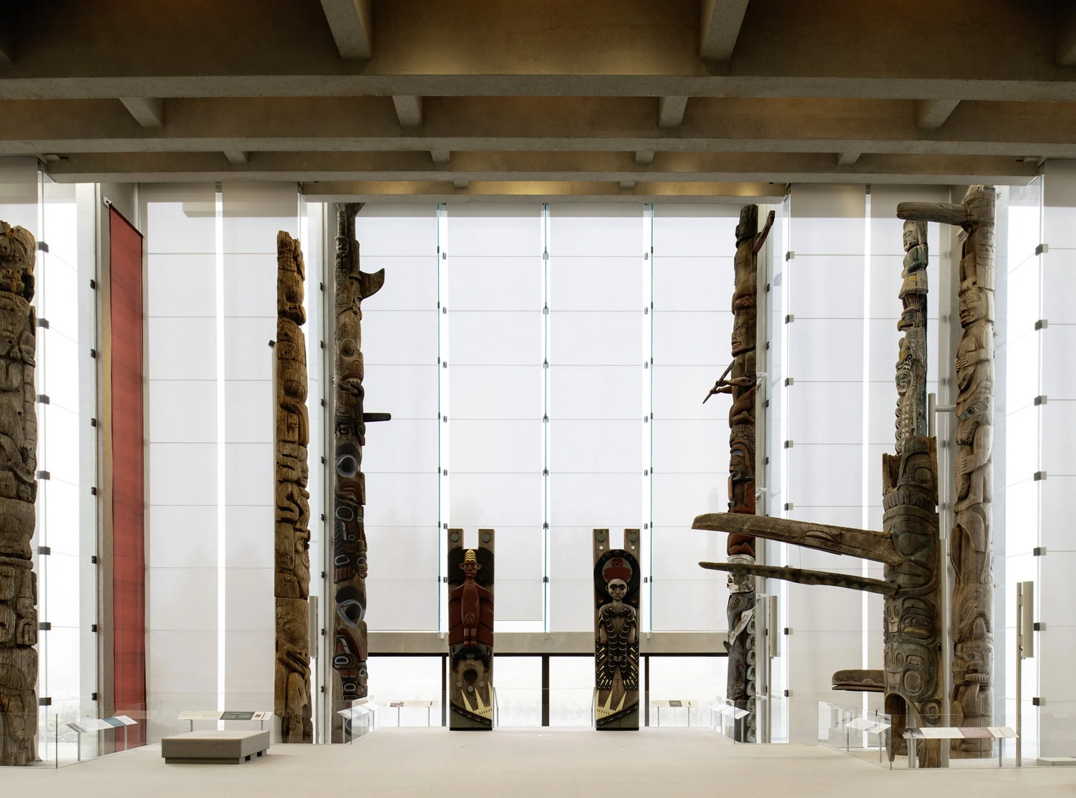
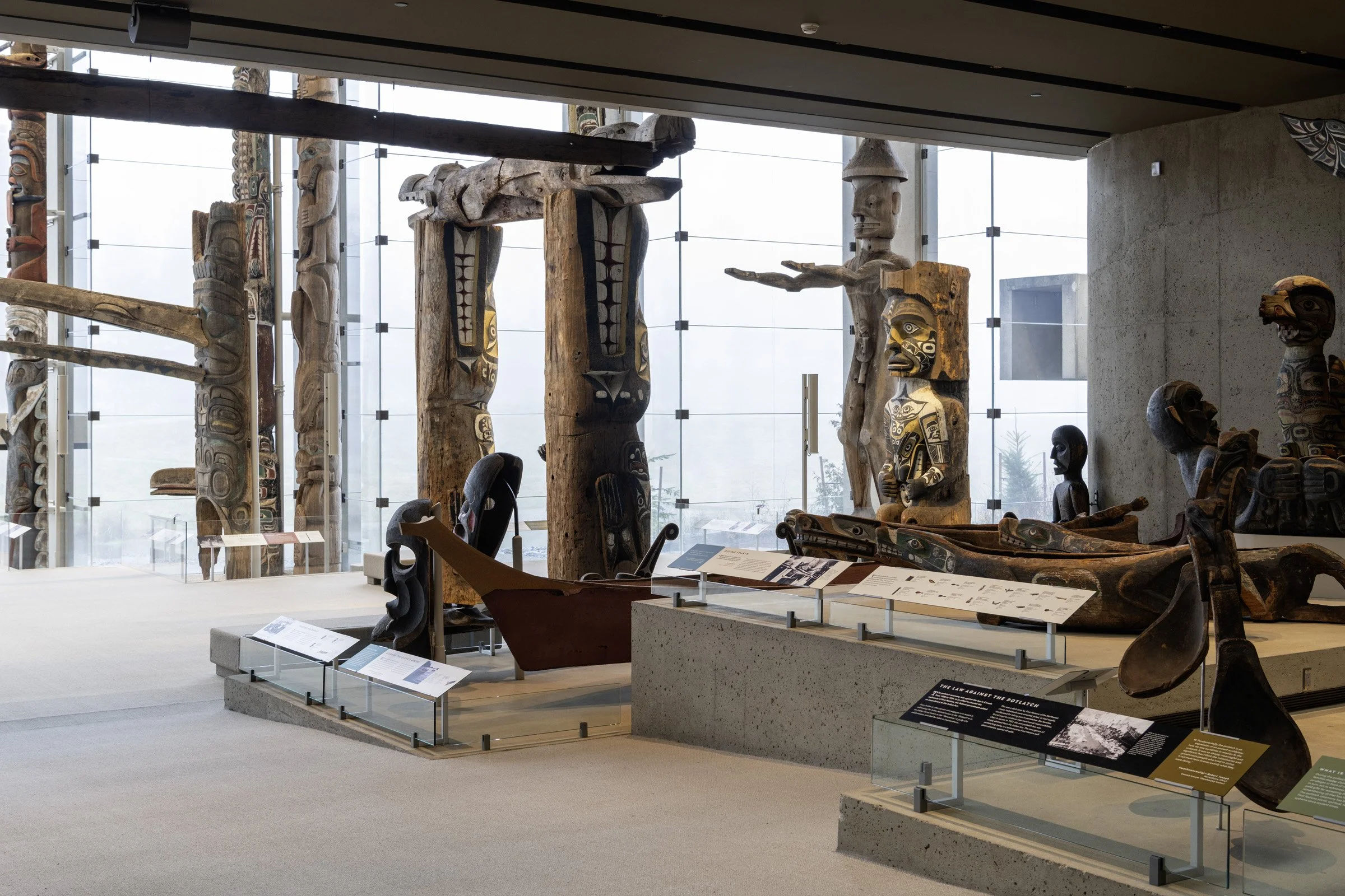
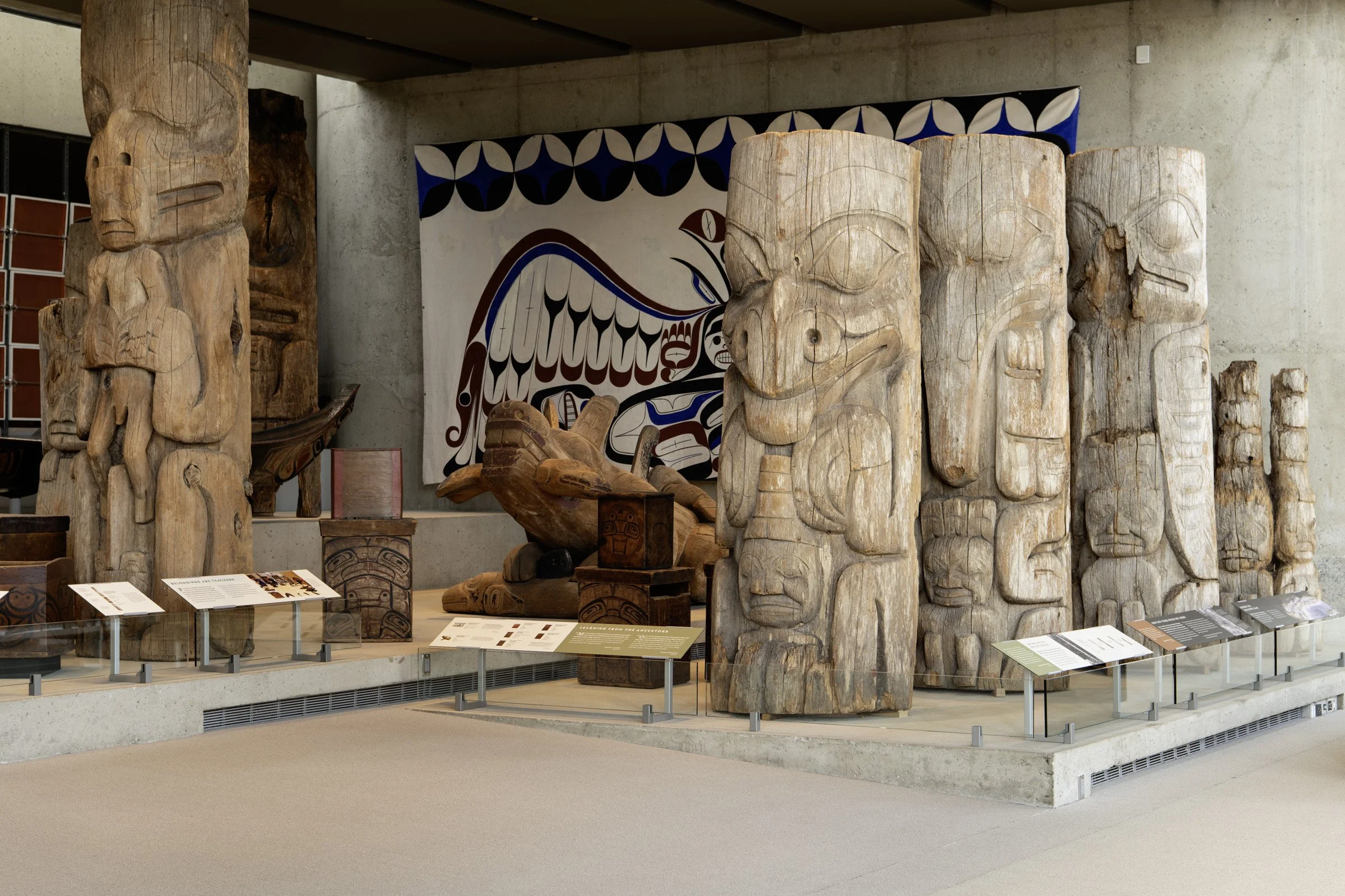
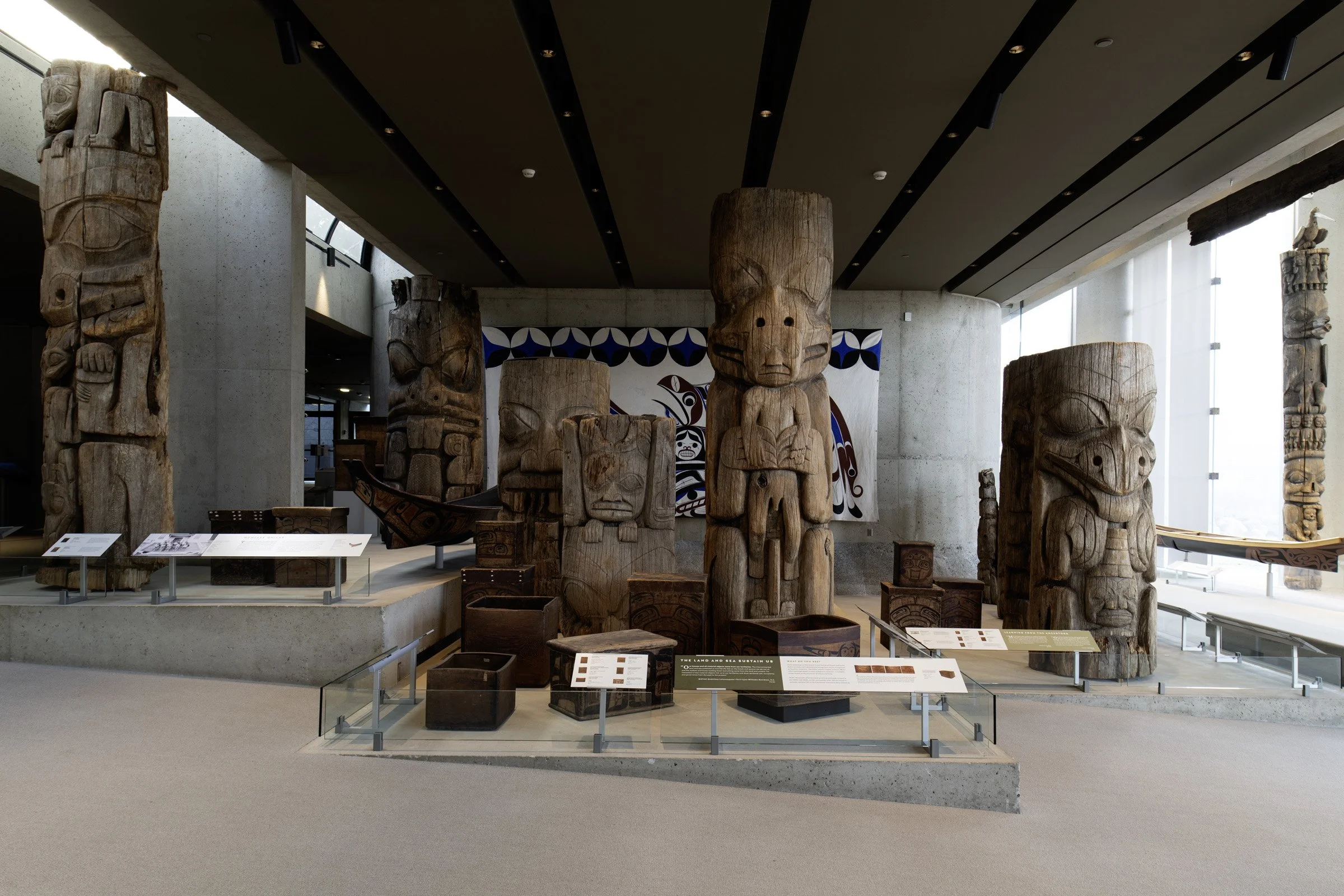
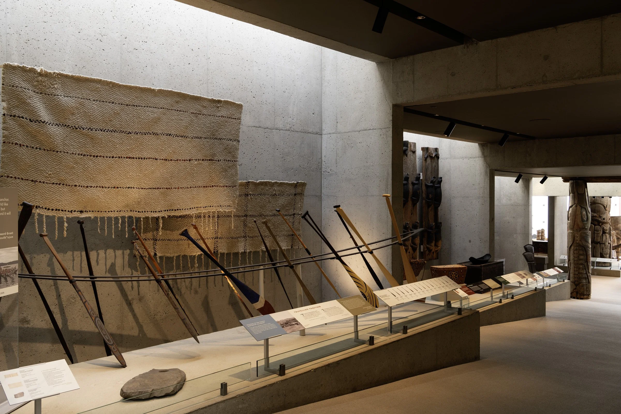
The Pacific Northwest Galleries encompass MOA’s Great Hall, ramp and crossroads. The Great Hall is the museum’s most prominent space and, for many visitors, the reason they come. Designing for these galleries meant working at the heart of how the museum presents the objects, stories and voices of Indigenous communities across the region.
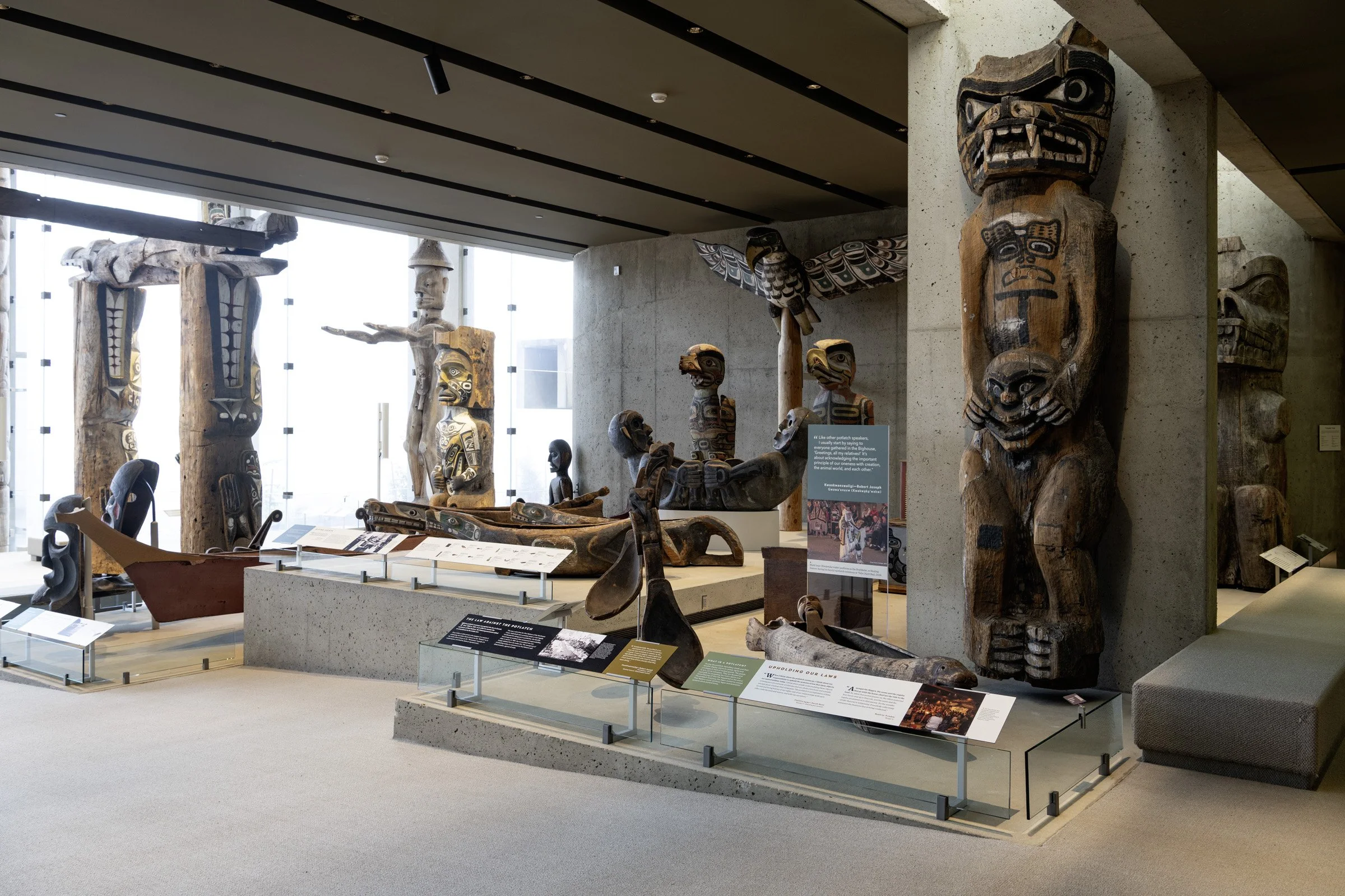
I worked closely with the curators and participated directly in meetings of MOA’s Indigenous Advisory Committee. I presented designs, listened to the stories, direction and differing opinions shared by committee members, and made design decisions in response to their feedback. The graphic system had to hold many kinds of material: contemporary voices, stories about objects and their makers, histories of colonial violence, and the information visitors are looking for to understand the objects before them.
I developed the colour, typography and label systems that set the direction for the galleries, then documented that work in a detailed exhibition package before going on maternity leave. Another designer carried out the subsequent label layout and implementation.
Role Exhibition Graphic Design Lead
Scope Design research and direction · visual identity · colour palette · typography · interpretive and object label systems · accessibility research · design presentations and consultation · production specifications and handoff
Starting with the conversations
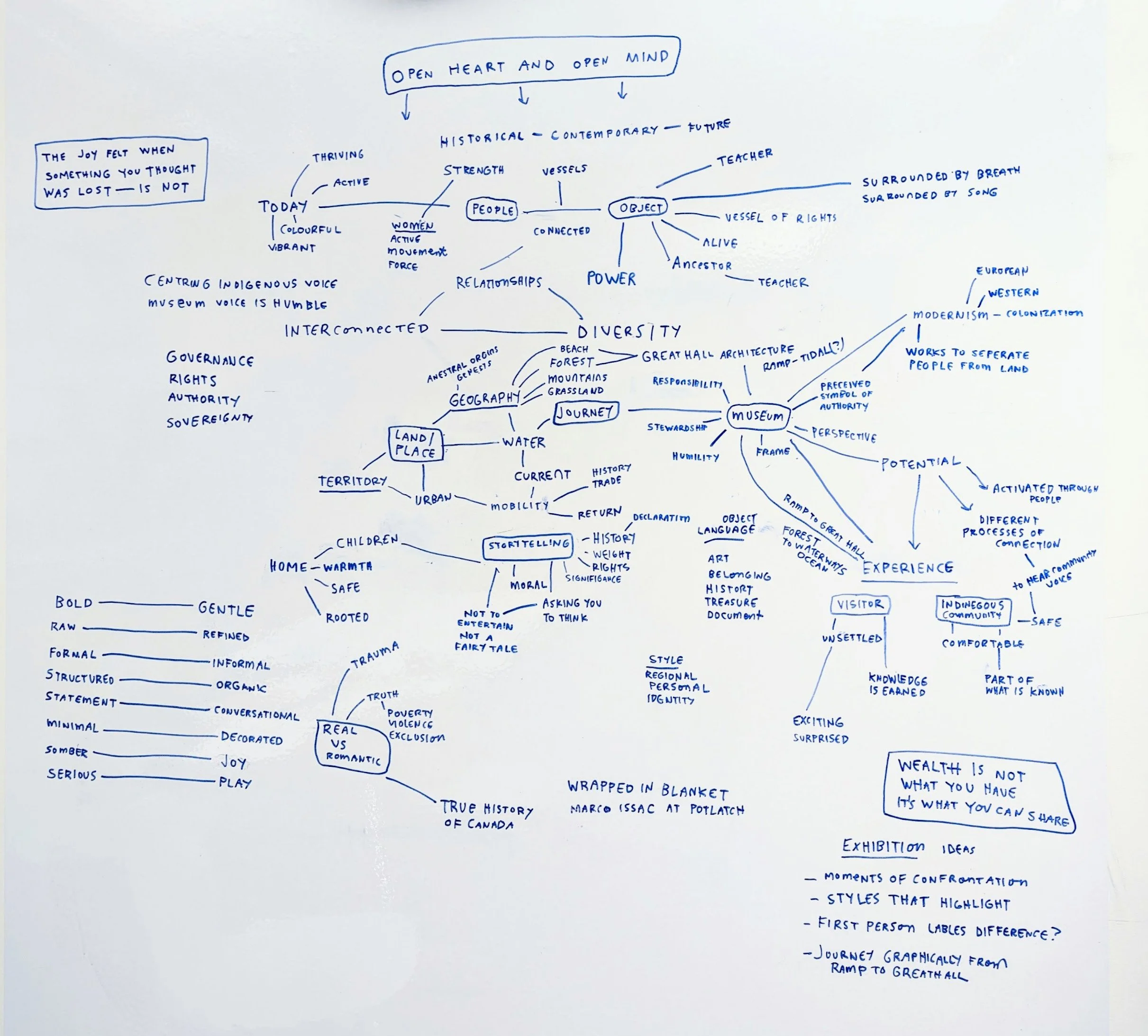
The design began with conversations and mind mapping with the curators. We kept returning to relationships: between people and objects, objects and places, past and present, and the museum and the communities whose belongings it holds. The galleries needed to be honest about colonial history while making room for strength, humour, knowledge and life now. They needed warmth without smoothing over difficult material.
Those conversations became three guiding principles for the project: approach the project with an open heart and mind; work under the guidance of the Indigenous Advisory Committee; and make clear that Indigenous people are here now, have always been here and will continue to be here.
I brought the developing visual direction, preliminary labels and map work to the committee in several presentations. Their guidance and approval were part of the design process, and the curators’ knowledge shaped how the system needed to work with the content.
Warmth, vibrancy and restraint
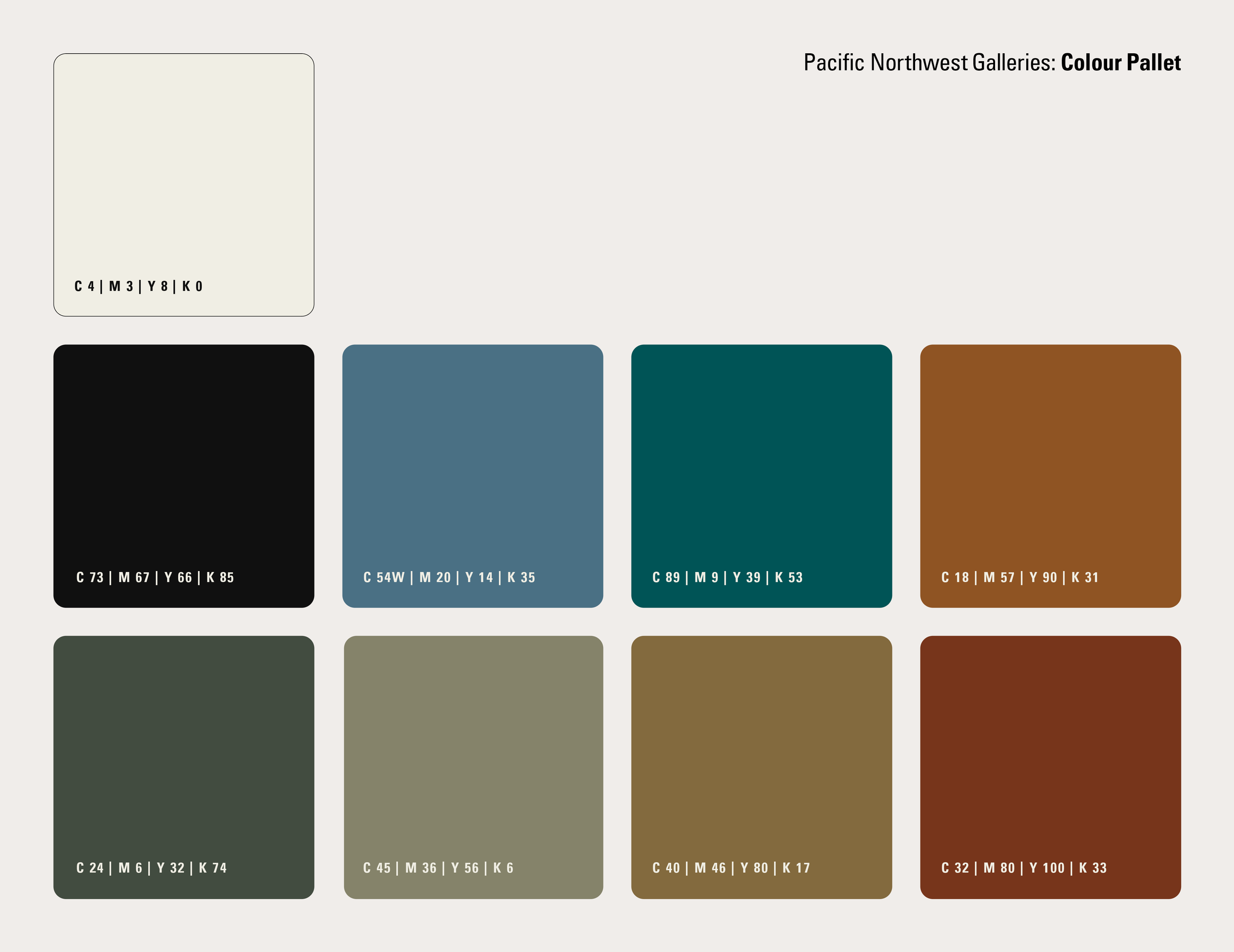
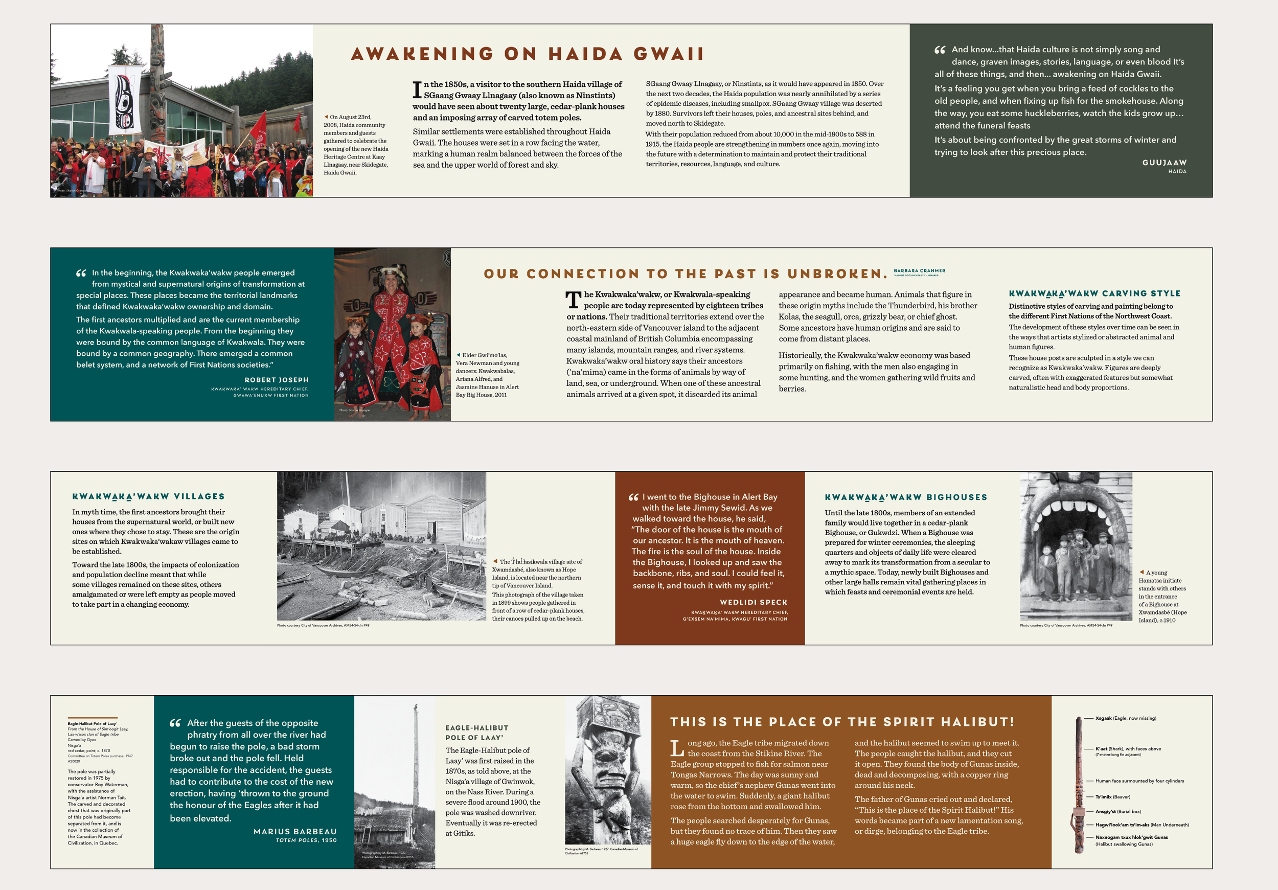
I built the palette around colours drawn from the Northwest Coast landscape and from Indigenous material culture: cedar, the the grey Pacific, forest greens, and the earthy reds of ochre and clay pigments. From there, I expanded the palette to give different voices and kinds of information their own presence within the galleries.
It was intentionally broad, but each individual label was meant to use only two or three colours. That gave the galleries warmth and variety while keeping the graphics restrained enough to sit alongside the objects rather than compete with them.
Giving Indigenous voices their own reading path
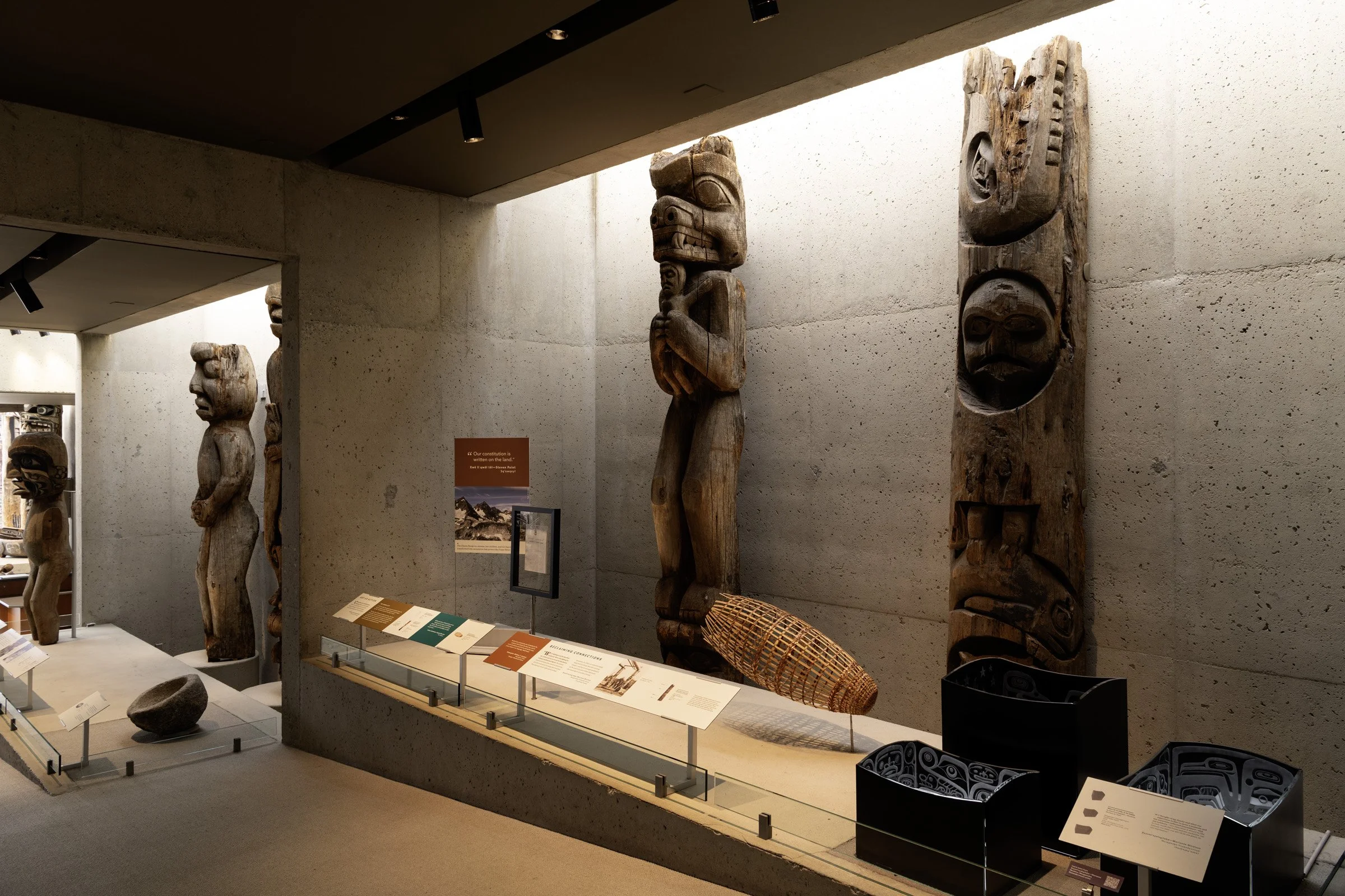
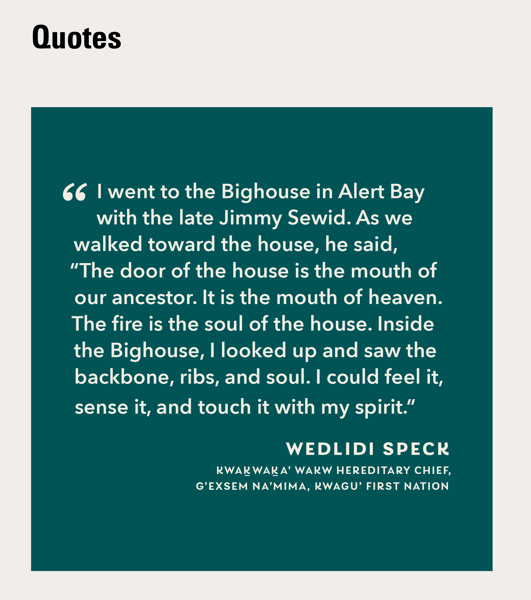
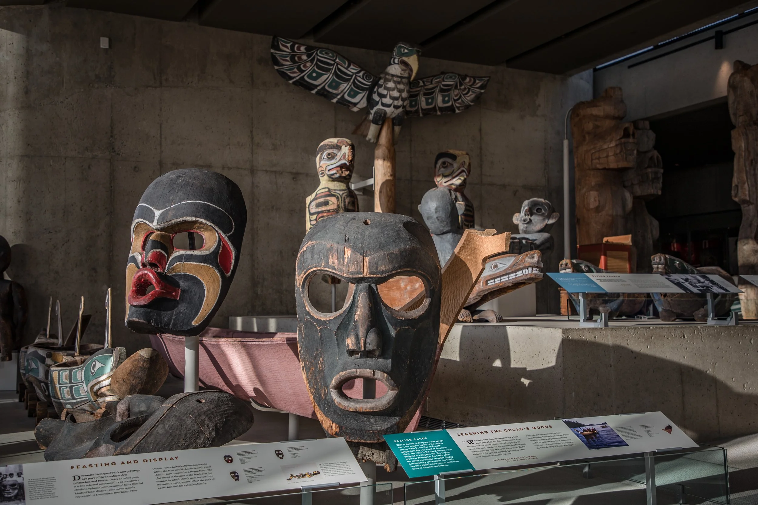
One of the central ideas in the label system was to give Indigenous voices a distinct and consistent presence. I used strong blocks of colour for quotations, stories and first-person voices so they would register immediately, while curatorial text sat within a quieter hierarchy.
The idea was that a visitor could move through the galleries following those coloured passages and, if they chose, read a route made up primarily of Indigenous voices. It created another way through the exhibition — one led less by curatorial interpretation and more by the words of the people represented within it.
Whose words a visitor encounters first is a design decision, and this system was intended to make those voices visible from the outset.
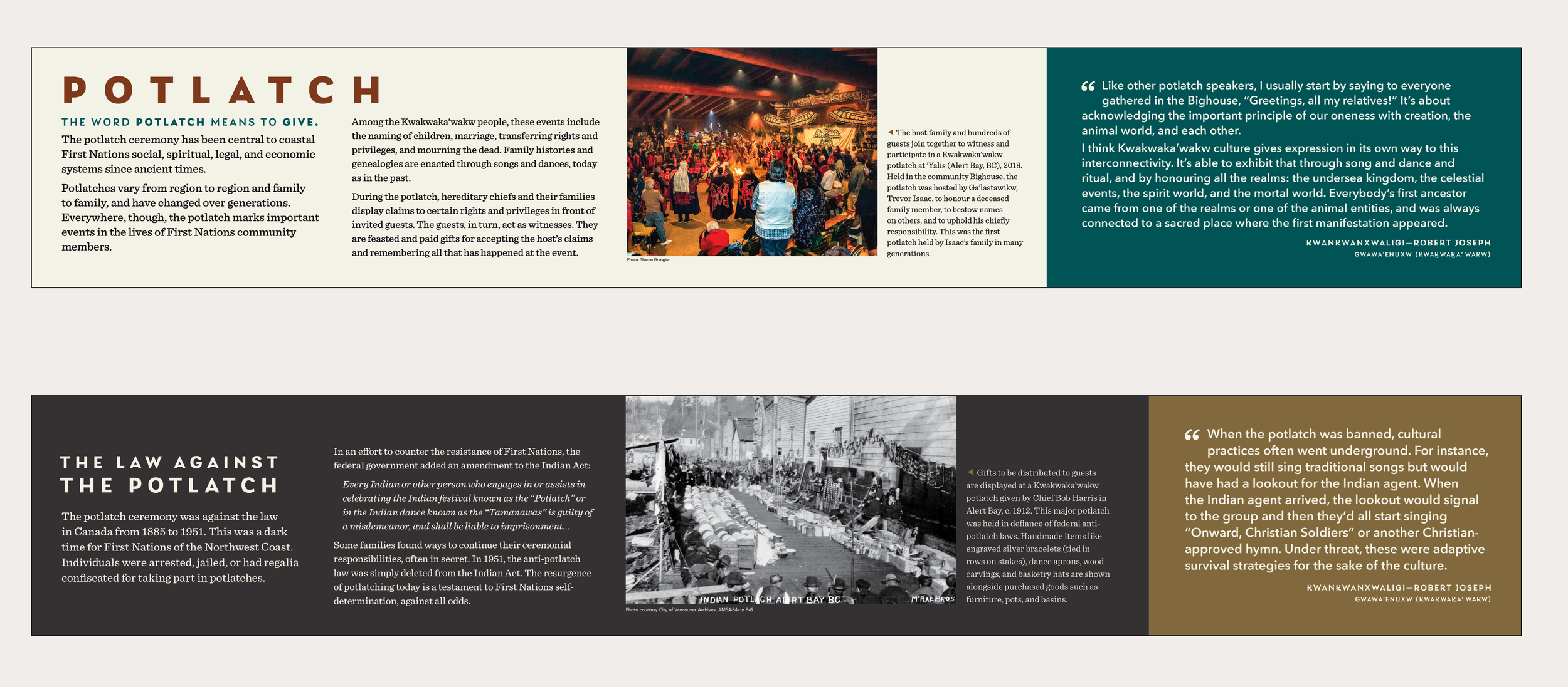
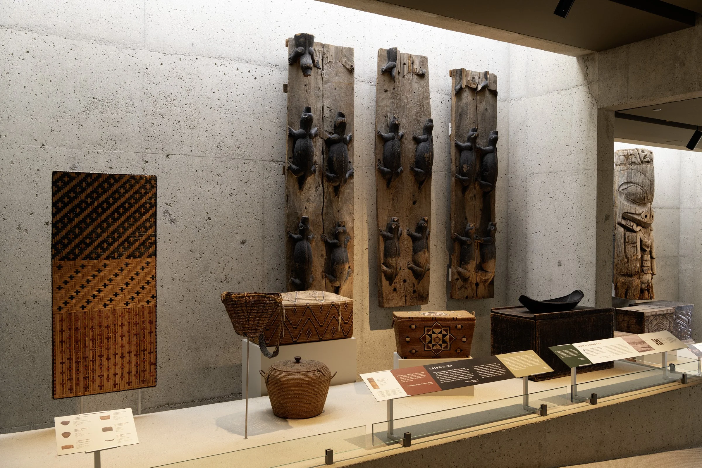
The system also needed to change tone when the content called for it. For labels addressing colonial violence, I proposed a quieter treatment with dark grey, cream and a single accent colour. Indigenous voices would still receive the same clear visual emphasis. The change in tone was meant to acknowledge the subject, not make those voices less visible.
Typography and Legibility
Designing for people who have to read it
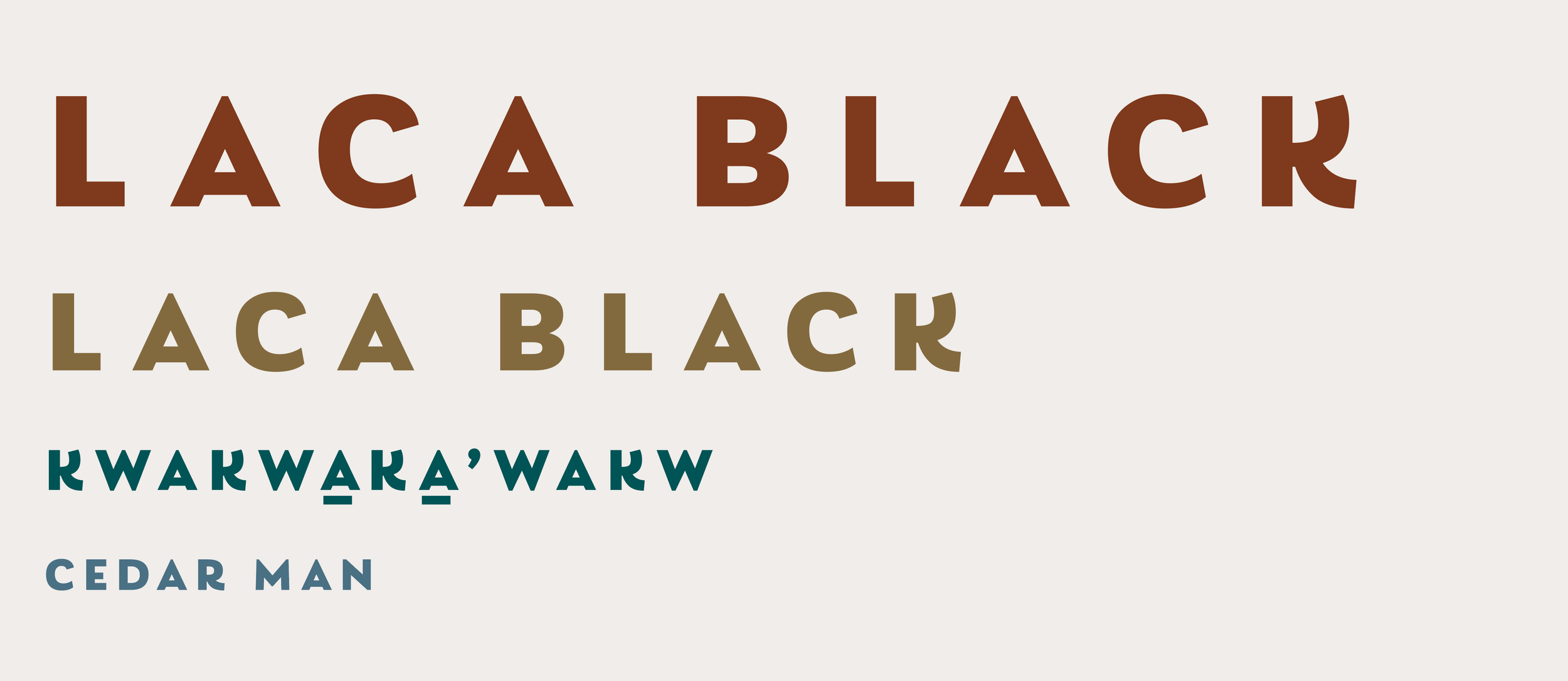
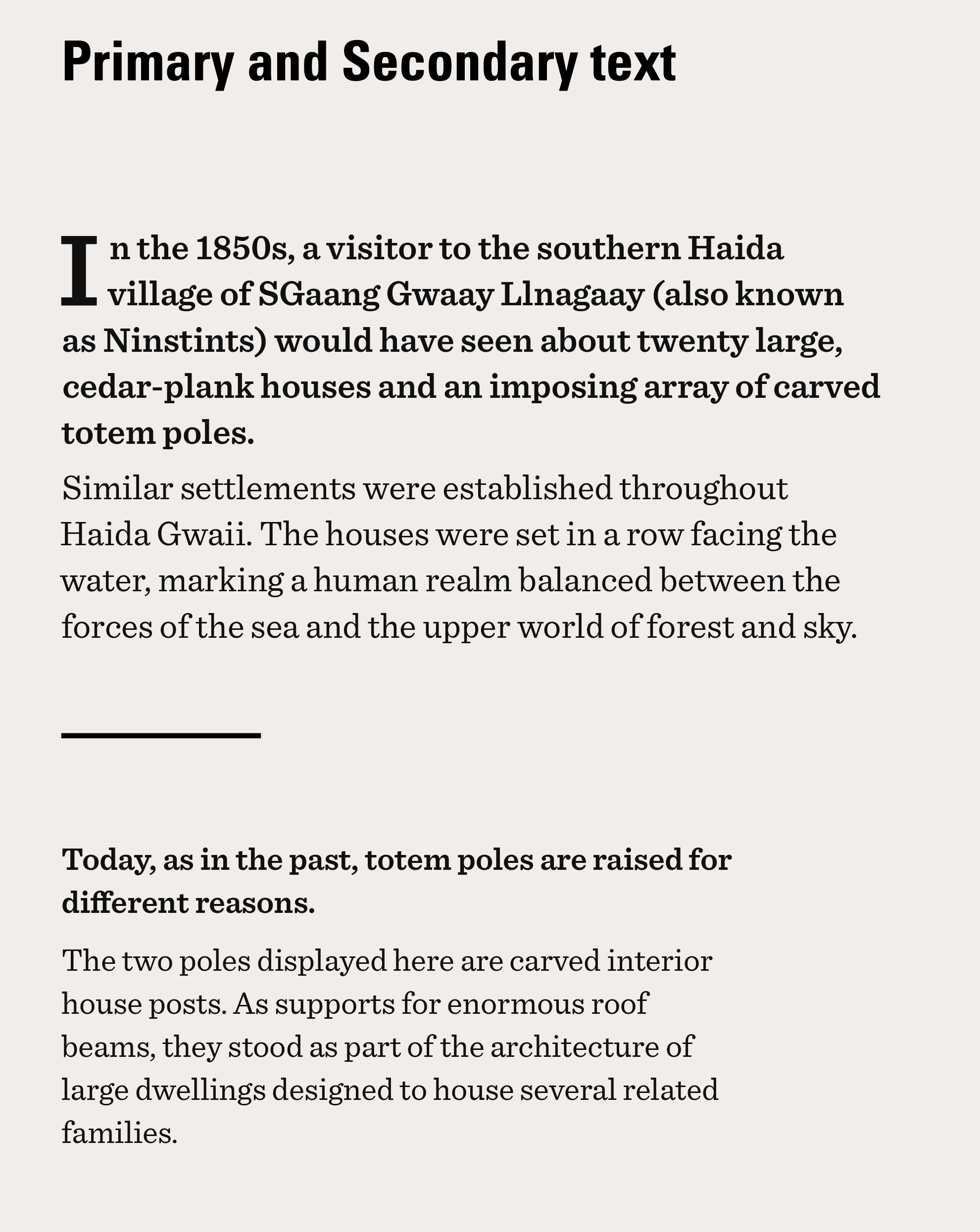
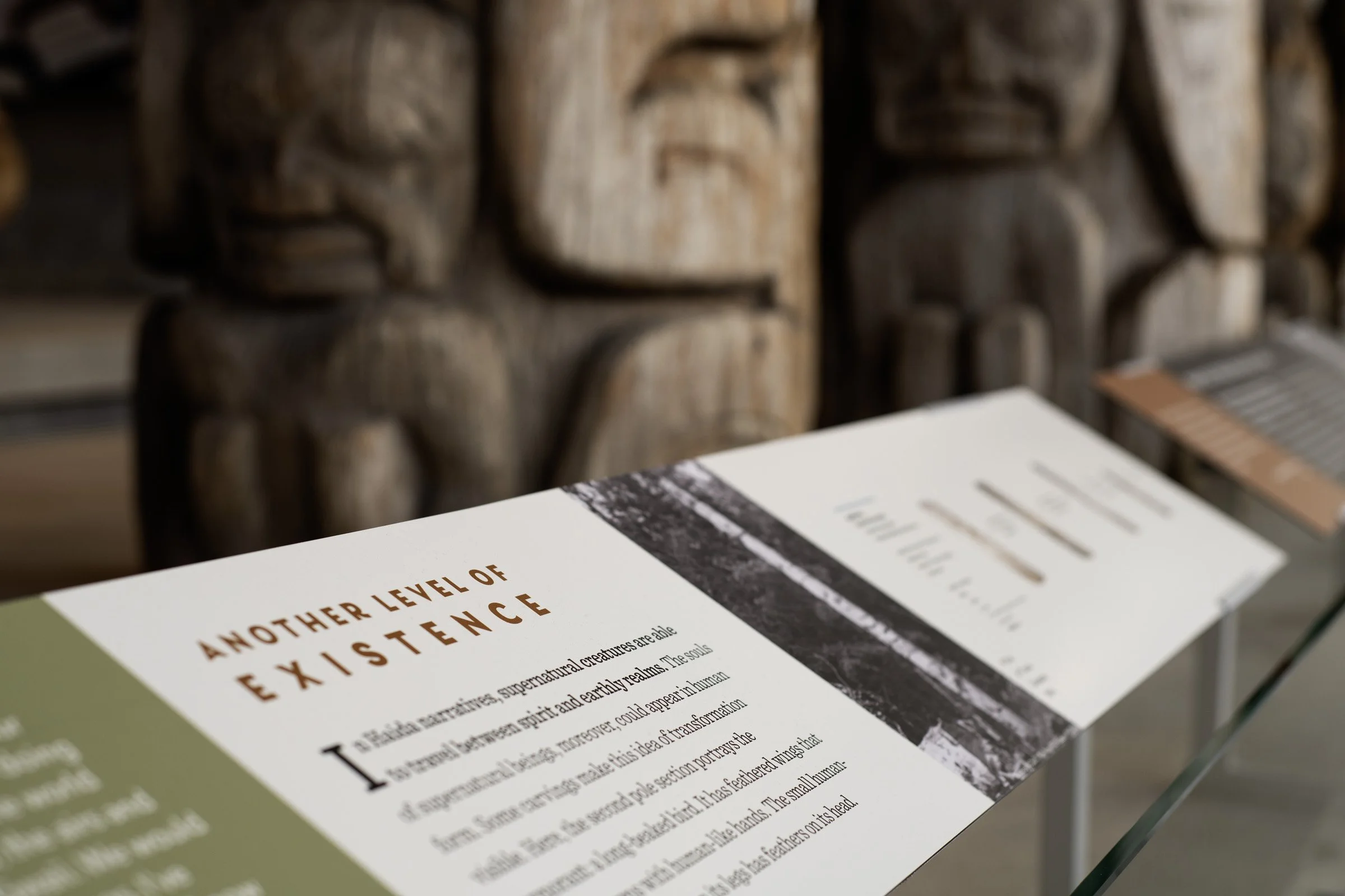
I researched legibility and accessibility while developing the label styles. The package specifies generous type sizes, readable line lengths, left-aligned text and a clear distinction between primary text, secondary text, quotations, captions and object information. I broke long passages into smaller sections and used headings, photographs and quotations to give visitors more than one way into a label. These choices matter in a gallery where much of the text is low, long and read while standing.
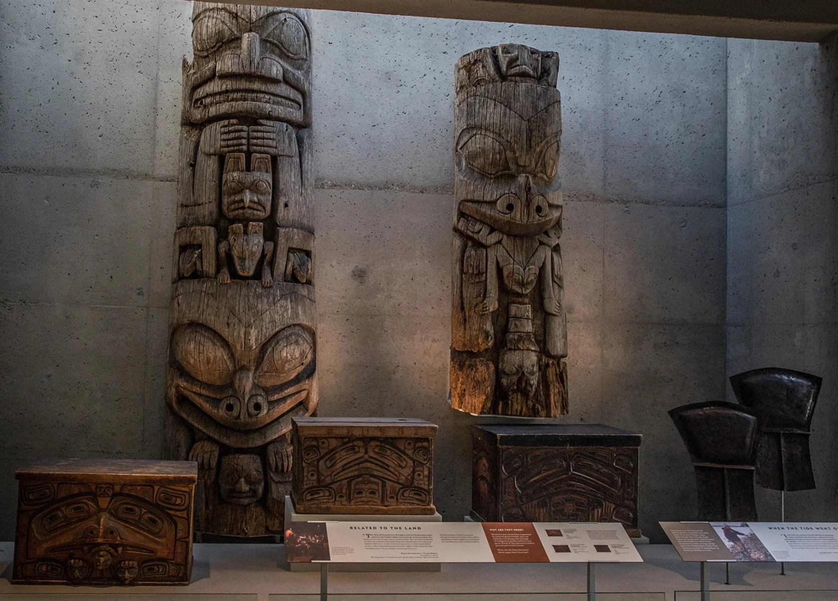
I selected and specified the typefaces, sizes, spacing and colour treatments for the main label families, along with detailed typesetting guidance. The system accounts for the wide didactic labels, smaller object labels, freestanding panels and labels in the Great Hall. I also worked through how object information could be grouped, how small cut-out images could help visitors identify a particular object, and how exceptions could be made without losing consistency across the galleries.
A Lasting Framework
The finished galleries bring together a wide range of objects, histories and voices within a system designed to feel cohesive yet distinct. The graphic language gives the space rhythm and clarity, leaving the collection, the architecture and the voices carried through the exhibition at the centre.
Credits
Curators
Susan Rowley and Karen Duffek, in collaboration with First Nations communities, families and rights holders
Indigenous Advisory Committee
səlisəye—Leona M. Sparrow (xʷməθkʷəy̓əm) · Marny Point (xʷməθkʷəy̓əm) · SGaan Kwahagang—James D. McGuire (Haida Nation) · Gid Kuuyas Collison-Robertson (Xaayda) · Sigidimnaḵ’ Noxs Ts’aawit—Dr. Amy Parent (Nisga’a) · Hlgu limx gibuu—Shaina Richelle Stephens (Nisga’a) · hagwil hayetsk—Charles Menzies (Gitxaała) · Amy Perreault (Red River Métis) · Robert Scow (Ḵwiḵwasutinux̱w and Haxwa’mis, Kwakwakaˇwakw) · Mamxuyu’ogwa Hawilkwalał—Kala Hunt (Kwaguł, Kwakwakaˇwakw)
Exhibition design
Skooker Broome
Graphic design lead
Cody Rocko
Graphic production design
MJ Araujo